Technology for Educators

October 30, 2010

MarkUp: Write on Web Pages

Filed under: Collaboration,Social Bookmarking — Sue Frantz @ 8:55 am

I have an assignment where I ask students to read a NY Times article on what constitutes good study habits. I ask students to identify the recommendations in the article and then evaluate their own study habits, noting any changes they intend to make. Since this is for an intro psych course, I also ask students to identify the independent variable and dependent variable in one of the studies described in the article. Right now I just let students pick from the few studies that are reported. If I wanted students to identify the variables in a particular study, I would have to describe the study in the instructions for the assignment.

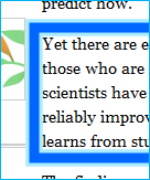
Enter Markup.io. Here I drew a box around the description of the study, then I added some text and an arrow.

There’s no service to sign up for. There’s nothing to download. You just mark up a webpage, click the publish button, and Markup generates a new web address. You can visit the webpage I marked up here: http://markup.io/v/fc6jmvrcft14.

Here’s how it works. Visit Markup.io. In the bottom right corner of that page, there’s a black box with white lettering that reads “drag to bookmarks bar.” Do that. Click there and drag it to your bookmarks toolbar in your web browser. This is what it looks like in my browser:

[At this point, I strongly encourage you to visit Markup.io, add the bookmark to your toolbar and follow along as I describe how Markup works. It’s much easier than I am able to convey in this post.]

Visit any webpage that you like. I’ll visit the study habits article. Click on Markup in your bookmarks toolbar. In the top right corner of your webpage, Markup will load this toolbar:

The first icon is a pencil. See the little tiny triangle at the bottom right of that icon? That tells you that that icon has other tools available. Clicking the pencil icon generates this dropdown menu.

The pencil lets you draw freeform. The arrow, square, circle, and line tools provide a more constrained image. They’re just like working with shapes in MS Word.

The Tt icon is for text. Click that icon, then click anywhere on the webpage where you would like to add text. While you can’t see a text box, it is like working with text boxes in MS Word.

Click the red box icon to see the color palette. Click a different color to change colors.

The next icon is a line-thickness control. Want a thicker line? Grab the gray arrow and slide it to the right.


Tips.

When you’re working with a particular image on the screen, say a box that you’ve just created, the box will sort of glow. It’s a subtle difference.

Box deselected.


Box selected


Click on a box to select it. It will glow to confirm that you did indeed select it. Now you can grab and move it. You can delete it, by just hitting the delete key on your keyboard. You can change the width of the lines with the slider tool, and you can change the color by using the color palette. You cannot resize it, though. If you need it to be a different size, just delete it and draw a new one.

After you’ve added some text with the Tt icon, click on the drawing (pencil) icon. Now when you mouse over the text, you can see the box around the text, and you can grab and move it wherever you’d like. As long as the text box is highlighted, you can change the font size by using the slider (move the slide to the right to increase the size of the font) and the font color by using the color palette.


Ready to publish.

You’ve finished marking up the page and are ready to make it publicly available to your students. Click the i icon.

That will generate this pop-up window.

Grab the green arrow and drag it to the right. If you’re not ready to publish, click the x in the top left corner to cancel.


Sliding to publish will generate this pop-up.

Highlight the URL, and copy it. (To copy, CTRL-C, or right click on it and select copy.) Click the x in the top left corner to close the pop-up.


Sharing the URL.

Give your students the Markup URL that was generated for your marked up page. When they visit the page, Markup loads a toolbar in the top right corner of the page.

Clicking “respond” will let visitors to the page add their own comments and drawings. It generates this pop-up window.

“Keep Marks” lets visitors add to your mark up. “Start Fresh,” unsurprisingly, erases your marks. In either case, visitors to your page then get the original Markup toolbar that you used to create your marks. When they publish, they’ll get a new URL. Your original URL will still take people to your marked up page.

Important note. Markup works by taking a screenshot of the webpage. That means that the hyperlinks no longer work. Clicking I in either the original or the respond toolbars will give the option to return to the original webpage.

As always, if you try it out, let me know how it works for you!

October 20, 2010

YouCanBook.Me – Let People Schedule Themselves

Filed under: Collaboration,Productivity — Sue Frantz @ 11:02 am

UPDATE  12/2/2010: Be sure to read my more recent post on this tool.

It’s surprising how much of my email has to do with scheduling. Students or off-campus colleagues ask when they can meet with me in person or via a phone call. I ask when they’re available; they ask when I’m available. Five or six emails later we have a time. For my colleagues at my institution, they can just look at my Outlook calendar and suggest a time. Anyone else is stuck in the email spiral.

If you use Google Calendar, YouCanBook.Me solves this back and forth email exchange. (Since my work life exists inside of Outlook, I sync my Outlook calendar with my Google calendar so any changes made to one are reflected in the other. Click here to learn how to sync Outlook with Google Calendar.)

I have granted YouCanBook.Me access to my Google Calendar. They generated a fully-customizable webpage (http://sfrantz.youcanbook.me/) for me that looks like this.

Everything in green is an available time slot. Everything greyed out is already a booked time in Google Calendar (and, by extension, Outlook). When I add an appointment to my Outlook calendar, Outlook syncs with Google Calendar, and Google Calendar syncs with YouCanBook.Me. YouCanBook.Me then greys out the time covered by that new appointment.

Clicking on Monday, October 25th, 9:00am brings up this page. The person requesting an appointment just fills in their email address, name, the reason for the meeting, and the code that appears.

Clicking ‘confirm appointment’ seals the deal. YouCanBook.Me makes the change on my Google Calendar which syncs with my Outlook calendar, and I’m sent an email informing me of the appointment. The person requesting the appointment also gets a confirmation email with a link to use in case of the need to cancel. Clicking the link causes the appointment to disappear from my calendar. The requester also gets an appointment reminder 4 hours before the appointment complete with that same cancellation link.

The Dashboard

Let’s take a look at the dashboard for YouCanBook.Me. This is where you can customize YouCanBook.Me to look and act like you want it to look and act. Directly below the dashboard is a preview of what the page will look like. Any saved change to the settings generates a new preview. To save space in this blog, I’m not including the preview image in my screen captures.

On the ‘basic’ tab, I can change which of my Google Calendars are accessed, the title that appears at the top of the page, what URL I want to use (‘sfrantz.youcanbook.me’), a URL for a logo (notice my college’s logo in the top right corner of the schedule page), instructions for visitors, and how many people I want to be able to sign up for a given time slot (one is fine for me). On the right I can set the first time available, the last time available, the time slot length, days per page, and which days I’m available. Of course if I’m traveling or doing something else that makes me unavailable for an entire day, I would block out that day using Google Calendar or Outlook, and that day would show as unavailable in YouCanBook.Me.

See the little blue question marks in each of the dashboard screen shots? At YouCanBook.Me, click those to learn more about each area of the dashboard.


On the ‘advanced’ tab, I’ve set the minimum notice to 12 hours. That means that the earliest available appointment is 12 hours from now. (A visitor at 8am cannot schedule an appointment at 9am.) I set the time zone to Pacific Time since I’m on the west coast, but visitors can change the time zone to their location. For instance, if an east coast colleague would like to schedule a time to call me, s/he could change the time zone to Eastern Time and avoid doing the math.


The ‘booking form’ tab contains one of the most powerful features of YouCanBook.Me. Each line is a separate field on the booking form. Want more fields? Just add a line. Want the field to be required? Put an asterisk in front of it. You can even add checkboxes if you’d like. (In the dashboard, click the little blue question mark at the bottom right of the field to learn how.)


The ‘afterwards’ tab lets you determine what is displayed on the screen after someone has made their appointment, the email address where you want to be notified of new appointments, whether you want to send a confirmation email, and what it should say.

The ‘reminders’ tab lets me set an appointment reminder for me (none), and lets me send an appointment reminder for those who set appointments and determine when I’d like it sent (4 hours before the appointment time).

Finally, on the ‘appearance’ tab, customize the colors of your calendar. If you want to use your own cascading style sheets, you’re welcome to do so using the ‘css’ field.

Try it out, then leave a comment on how it works for you!

[UPDATE 11/24/2010 : Check out a newer post that offers some ways to customize YouCanBook.Me.]

October 9, 2010

Poll Everywhere

Filed under: Presentations — Sue Frantz @ 1:18 pm

I use a student response system in my classroom (iClicker) for low-stakes quizzes and for ungraded questions that give me a sense of what my students are getting and what’s still a little fuzzy. If your institution doesn’t have funds to support this technology, or if you’re not sure you’d use it enough to make it worth the expense, consider trying Poll Everywhere.

Poll Everywhere uses your students’ cell phones as ‘clickers.’ All you need is a live internet connection in your classroom.

Cost: If you choose ‘higher education’ you can collect up to 32 responses per question for free. If you would like more students than that to respond, you’ll need to invest in the $700/year upgrade. The upgrade also comes with some additional functionality, like being to link each student’s response to their name. For the purpose of this post, I’m going to stick to the features of the free version.

When you visit Poll Everywhere, you’ll create a login. After you register, click “Create New Poll.”

For this post, I’ll walk you through creating a multiple choice poll. In the free text poll, students can text whatever they’d like. Depending on your class, this might be a bit risky. In the paid version, you get to see what students are texting and have the option to approve it before it’s displayed.

Type in the question you’d like to ask, and then type in your possible answers. Poll Everywhere defaults to 3 responses. If you want more, click the ‘add an option’ button. If you want one less, just leave one blank.

Here’s a question I created.

Right under the question, it reads “Text a KEYWORD to 22333.” Students pull out their cell phones, and send a text to the number 22333. In the body of the text, they punch in the number that corresponds to the name. In the free version, Poll Everywhere assigns a number to each response. In the paid version, you can decide what the keyword will be. If I were using the paid version, I would choose each person’s last name as the keyword, so instead of 15662, students would text gage.

Students can respond in other ways, say by computer or smartphone. On the right side of the screen, select ‘Ways People Can Respond,’ and check off the relevant boxes.

After sending in my text, the screen updates in less than 5 seconds. At the very bottom of the graph, you can see that 1 person has voted, and all 1 of us agrees that Gage would be the person to have coffee with.

If you’d rather not leave your (PowerPoint, KeyNote or Mac PowerPoint) presentation to ask your question in class, select “Download as Slide.” In the downloaded file, the first few slides offer instructions and tips. The last slide contains your question, although it doesn’t look like it. This is what it looks like.

To paste it into your existing presentation, on the far left side where all of the slides are, right click on the last slide, the one with your question that you can’t see. Select ‘copy.’ Open the presentation that you want to put the slide in. Of the left, right click between the two slides that will bracket your new slide. Click ‘paste.’

You can treat this slide just would any other slide. The box with the big X in the middle is where Poll Everywhere will import information from their website.

When I run my presentation, this is what my slide looks like.

This slide will be updated in real time as students vote.

If you don’t want your students to see how everyone else is voting, mouse over the left side of the question stem. See the 6 little transparent boxes? That’s the ‘instructions’ icon. Click it.

That will hide the results and only show students their voting choices.


To show the results, mouse over the left side of the question again. This time a transparent ‘results’ icon appears. Click it to show the graph.

Mousing over the right side of the question pulls up the settings icon.

Clicking it provides a menu with 3 options at the top. Try out the various settings to change how the slide is displayed. All 3 sections will allow you to stop the poll. You can also choose to ‘clear the results.’ That’s desirable when you have 32 students in your current class with another 32 coming in right after them.

All of your questions are stored in your Poll Everywhere account. Just log in to add new questions or edit your existing question. If you edit a question, any presentation file that already contains that question will automatically be updated.

Standard text messaging rates apply. In other words, if your students don’t have unlimited texting, the text to Poll Everywhere counts against their monthly allotment. Smartphone users and laptop users can go to poll4.com and just enter the 5-digit keyword next to the answer they’d like to choose. No text messaging cost that way. The poll is open. Try it!   See the live poll here.  (Remember that 32 is the maximum number of responses.  When it hits 32, leave a comment, and I’ll reset the question back to zero.)

Create your own sms poll at Poll Everywhere
<script language=”javascript” src=”http://www.polleverywhere.com/polls/LTIwODMyNzgxMTY/chart_widget.js?height=250&results_count_format=percent&width=300&#8243; type=”text/javascript”></script><div style=”font-size: 0.75em”>Create your own <a href=”http://www.polleverywhere.com/”>sms poll</a> at <a href=”http://www.polleverywhere.com/”>Poll Everywhere</a>
</div>

October 5, 2010

Outlook: Moving up or down?

Filed under: Email,MS Office — Sue Frantz @ 10:39 am

It’s been a few months since I posted, and I’m emerging from my technology sabbatical. Fall quarter is in full-swing; it’s time to share what’s new.

It’s often the day-to-day kinds of activities where a little change can make a big difference. My focus in this post will be changing a default setting in Outlook that affects the order in which Outlook shows you messages.

Outlook assumes that you want to start reading the most recent message first. After deleting or filing the first message, Outlook takes you to an earlier message.

But that’s not how I read my messages. I start with the earliest one I haven’t read and then move forward in time toward the most recent message.

If I had no other mail in my inbox, it wouldn’t be a problem. However, mail I haven’t decided what to do with yet stays in my inbox until I have time to get to it. For instance, in the example I’m using, I may begin reading with the email marked with the arrow below.

After I delete or file that message, Outlook automatically takes me to the message below it. But I’ve already read that message. I want to move to the one above it. To do that, I have to use the arrow keys or the mouse to navigate. Or I can change Outlook’s default setting so that it moves up instead of down.

In Outlook, go to the File tab and select Options. Click Mail. Scroll down to the very bottom of the screen. In the dropdown menu, select “open the previous item.”

Click OK.

Now when you delete or file email messages, Outlook will automatically advance to the next most recent item.


Blog at WordPress.com.